Layout constraints
Pagedraw has it’s own layout system for you to define how each artboard looks on different window or device sizes, and with dynamic content of varying size. There are two main tools you’ll use to define your resizing behavior:
- Screen Size Groups, for separating desktop vs mobile behavior by window size breakpont
- Constraints, for resizing within a breakpoint
If you’re familiar with them, constraints loosely correspond to flexbox, and screen size groups correspond roughly to @media queries. You don’t have to know either in order to use Pagedraw. Our layout system is designed to be as powerful, but easier to use and unencumbered by legacy technology decisions.
Although we generate flexbox code, and some ideas were drawn from flexbox, we consider iOS’s Auto Layout feature to be a more comparable system. We use the word “flex”, but our system is not flexbox.
Constraints
In order to make responsive screens you can use our layout constraint system. Each block has checkboxes flexible width, flexible height, and flexible margins which do exactly that: make them flexible so they resize when the parent (or sometimes the screen) resizes. Play with them and you should get a feel for it.

Screen Size Groups
Screen size groups let you design separate artboards for a screen when viewed on mobile vs desktop. The artboards are completely independent, and, if you choose, can have nothing in common with each other. Typically, of course, you’ll want them to have the same content in a different arrangement.
A screen size group, (or SSG,) is a block you draw around several artboards. It looks and works like a multistate. You can add one from the Add menu in the topbar.
SSGs work by picking the artboard closest to the user’s screen size to show them. Under the hood, they’re just @media queries looking at window width. You’re welcome to make more than just mobile and desktop variants; you can put as many artboards in a screen size group as you like. There’s nothing special about mobile vs desktop; in all cases, the screen size group will present whichever artboard is closest in size to the user’s window.
https://pagedraw.io/fiddle/Ao82QUv-stGx demonstrates a screen size group with mobile and desktop artboard variants.

Scrollable Areas
By default, your pages are scrollable when they’re longer than your end user’s screen. If you’d like to make a sidebar scroll (or not scroll) on its own, you can use our “scroll independently” feature. Just draw a rectangle around the area and mark the Scroll Independently checkbox in the rectangle’s sidebar. See https://pagedraw.io/fiddle/NYyPd5_NWtss for an example.

Common gotcha: partially overlapping blocks
Pagedraw doesn't fully handle partially overlapping blocks yet. Two blocks are partially overlapping if they're overlapping, but neither is entirely inside the other, like this:
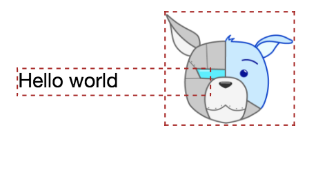
The editor will use red, dotted lines like above to highlight partially overlapping blocks.
When this happens, we’ll generate position: absolute code that doesn’t resize or reflow correctly.
You rarely want partially overlapping blocks. Usually, you have a case where one should be inside the other, but is misaligned by a few pixels. If you'd like to have elements overlapping in your app, you should consider making them a single image instead. Layouts that need a lot of partial overlapping are likely bad candidates for using Pagedraw today.
Experimental feature: have the AI guess your constraints
Pagedraw can try to guess the constraints you’ll want for an artboard. Click the Infer Constraints button in the artboard’s sidebar to have us set all the constraints for all the blocks in the artboard to our guesses. We’ll ignore all of your choices, so this is only recommended for when you’re starting to mark up a fresh artboard.
This feature is experimental, so don’t expect the automatic choices to be 100% right. We’re looking to integrate this feature more deeply into a feature version of the product.

Layout System Formal Spec
If you want to see the details, the full Pagedraw Layout system spec is available. Note that this is still a draft.